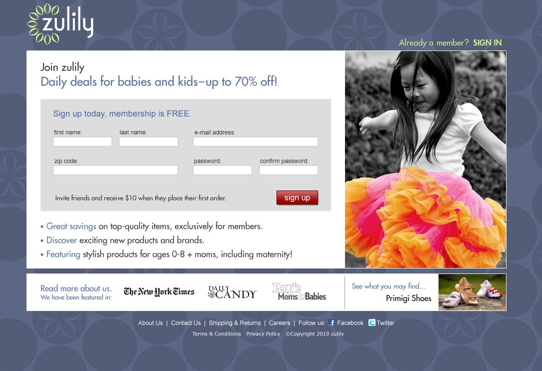
Zulily Sign Up Wall
The point of entry to zulily’s daily deals, the sign up experience was a pivotal touchpoint for multiple stakeholders. A test & learn approach positioned Design to take the lead and solve for optimization between customer acquisition, retention, and experience.
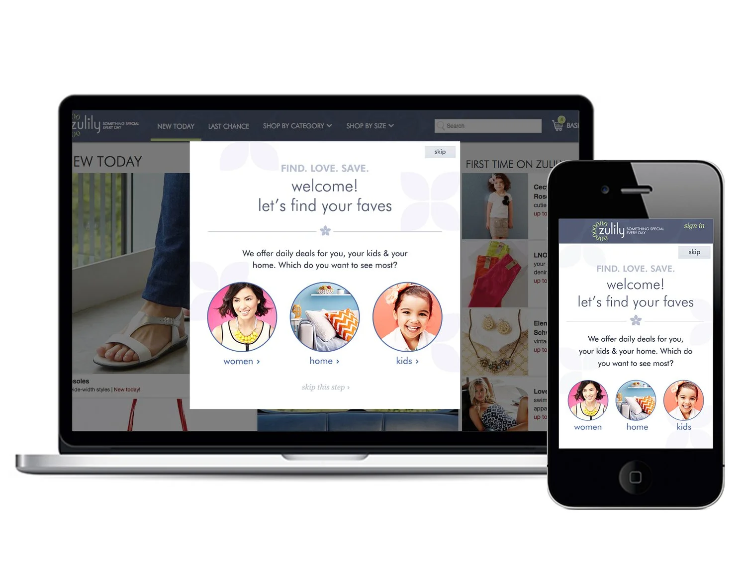
To navigate gridlock between Acquisition goals (which urged easy access) and Retention (which demanded customer information) I took the approach of exploring the extremes – what were all the possibilities that we could pursue, prioritize the best ideas from each extreme, and begin testing our best bets against one another?
Design wise - I had a few hypotheses:
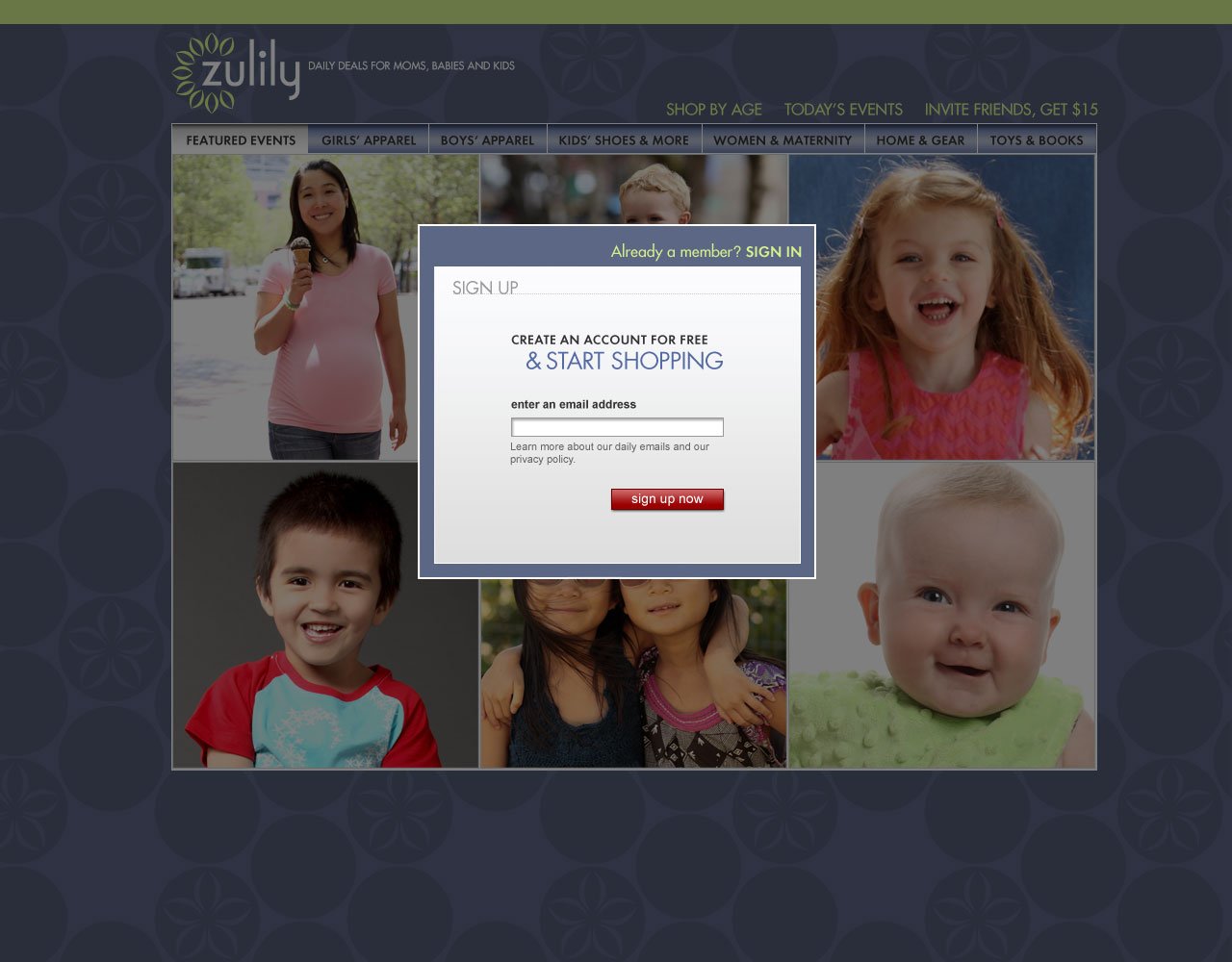
Shopping is fun, not work, and if it looks like “work” then potential customers won’t be motivated enough to sign up – and it didn’t take a lot of fields to look like “work”
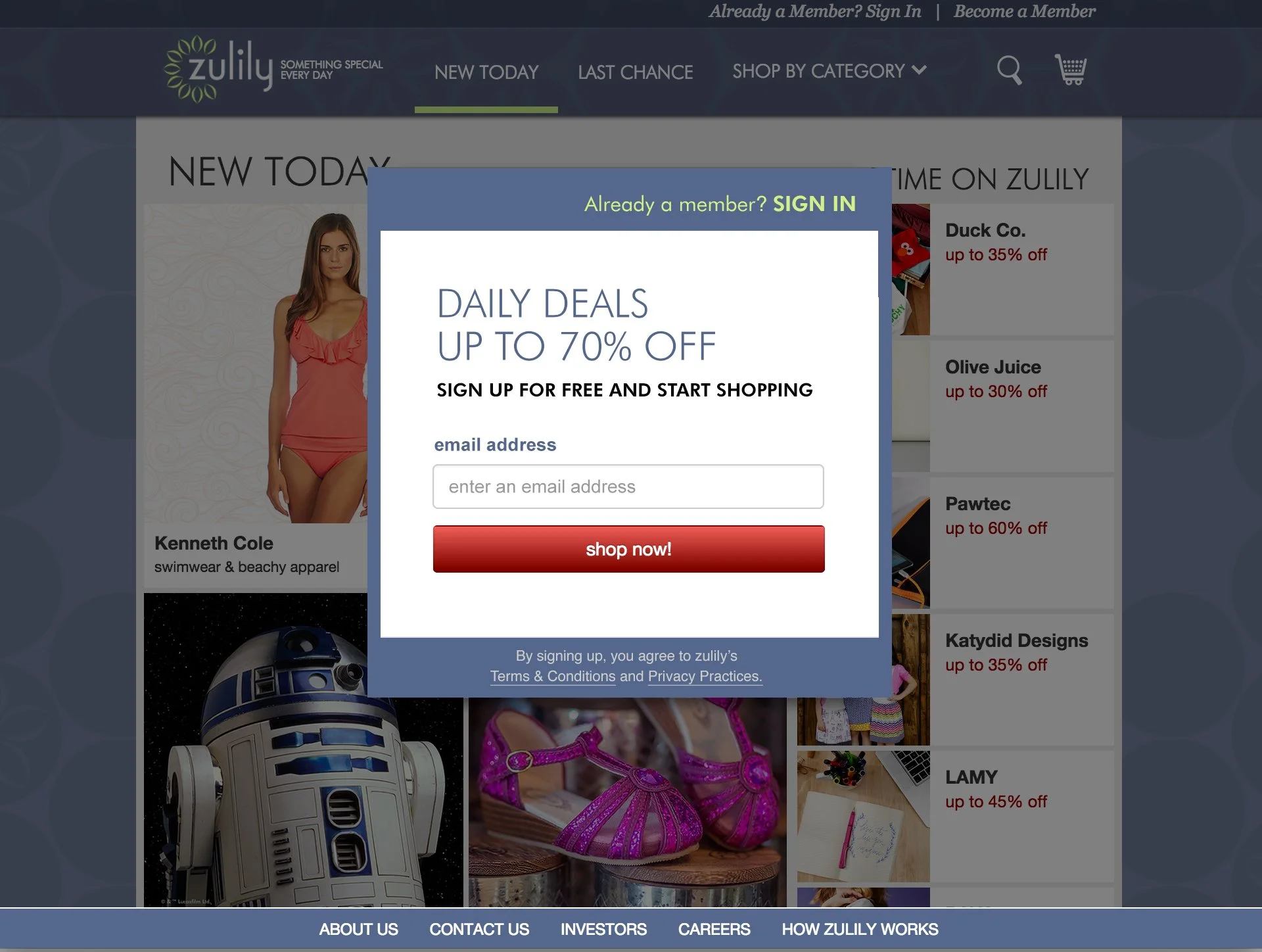
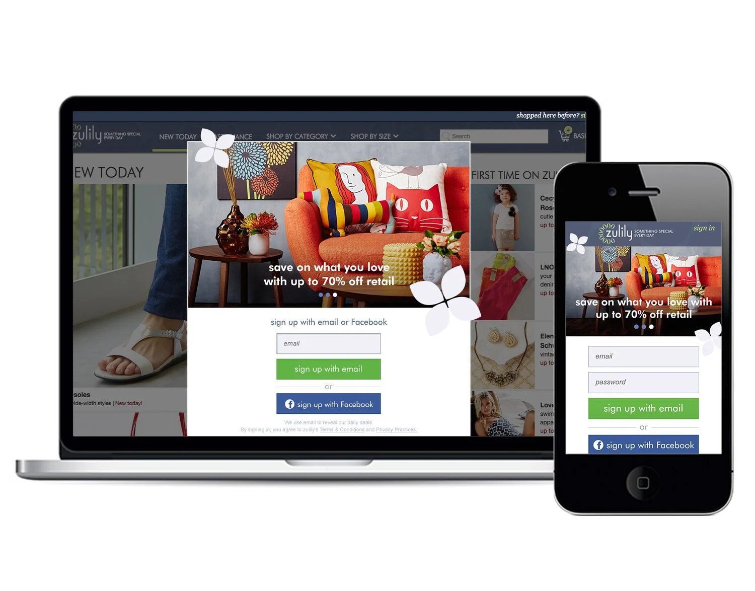
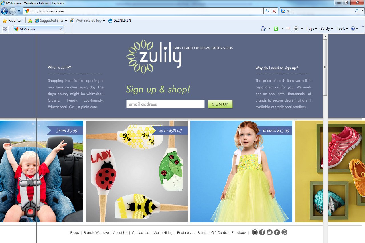
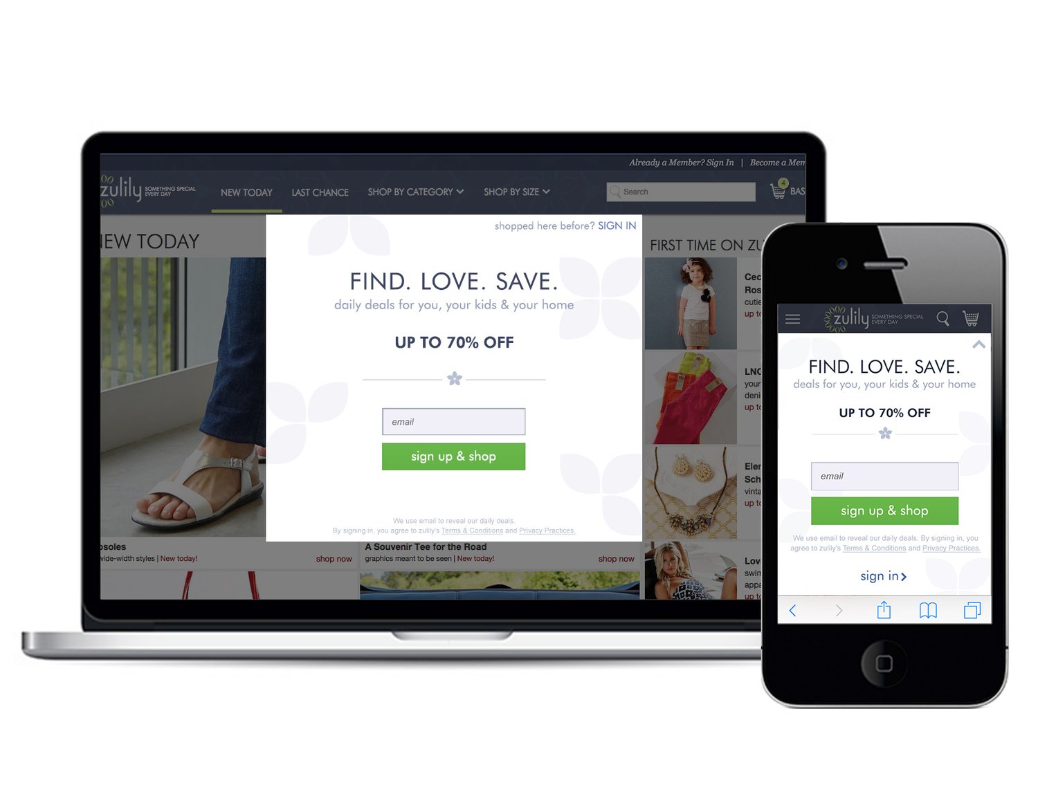
If customers could “look behind the curtain”, then we wouldn’t have to do as much storytelling in copy – picture is worth a thousand words
With less copy, fewer words would pack a more powerful punch – so the headline copy mattered as much as the experience design
The outcome of initial testing was so remarkable that SISU testing became fundamental work in marketing + tech for the next year. In the end, maintaining a barrier to entry proved critical to building customer LTV, but reducing that barrier to a simple flow significantly improved conversions. Initially, building a true peekaboo “wall” (to see what was live today before signing up) was a technology hurtle, so to test, I created a “faux” peekaboo to express the idea of seeing behind the curtain. Once the conversions proved out, investment in bringing it to life was a no-brainer, and you can see that the same basic signup flow I designed a decade ago is still in the same basic form today.